

Known for their global impact and origins within the Ecological Society of America, The Nature Conservancy has conserved millions of acres of land and water since 1951. With a reputation for maintaining accountability and remaining transparent, the organization has been a long leader in conservation, guided by science-based, collaborative, and nonpartisian solutions. The challenge was to retain brand equity while evolving the existing identity to better align with modern design standards.
The new identity maintains a few key elements: a website and stationary with generous white space, a refreshed serif typeface and earthy color scheme, and powerful use of the leaf strokes throughout the website. Together, these systems strengthen their values and trustworthiness as an organization. The result is a rebrand that inspires action.
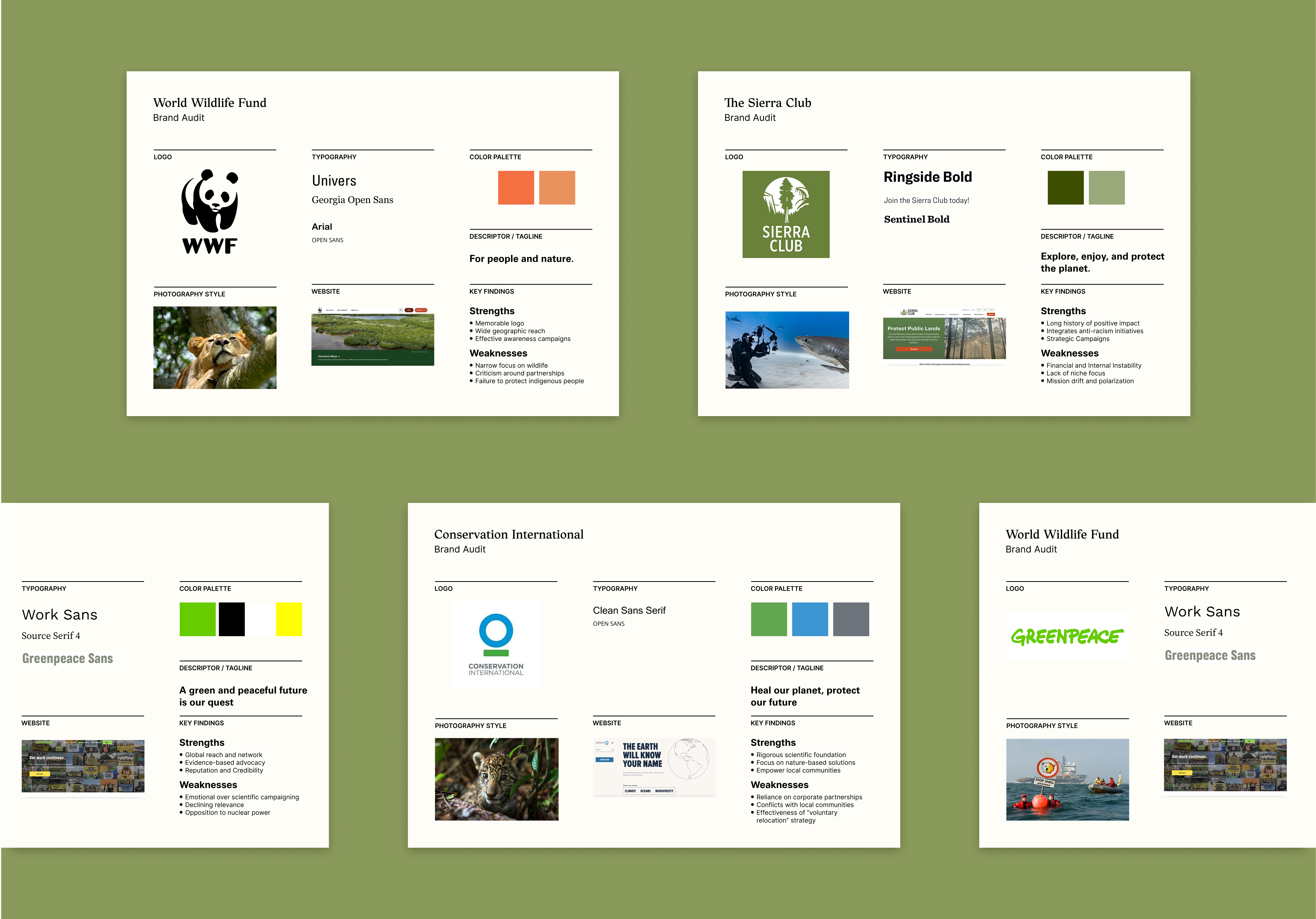
An audit revealed an opportunity to bring greater clarity and cohesion to the brand. By modernizing its design system while preserving the organization’s legacy, the rebrand seeks to reflect its global impact and continued leadership in conservation.
The serif wordmark and globe-leaf icon conveys tradition, but feels dated. Its detail and form limit scalability and fail to reflect the organization’s modern, science-driven mission. This leaves room for a more adaptable, contemporary identity.


The human character of the Textworthy typeface, based on classical writing with a pen, reflects the organization's science-driven mission while maintaining a human touch. It pairs seamlessly with the new symbol for a cohesive, contemporary identity.


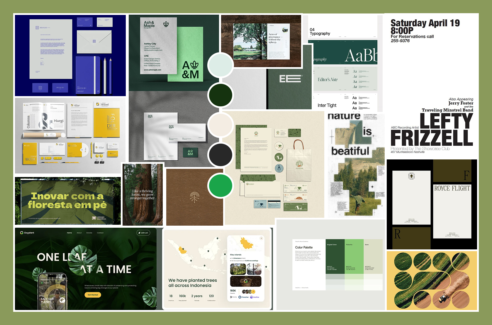
These guidelines outline the refreshed visual identity, emphasizing clarity, accessibility, and intentional photography. When photography is used, it shifts between species-focused and ecosystem views, emphasizing the interconnectedness of all life on earth.
.png)
.png)


